The distributor's job is to produce a plan so they know their target audience for it to make sure it will be successful. As well as releasing the film the person has to create trailers, posters, billboards, TV ads, cinema ads etc. to get the biggest audience possible. These all target various audiences as people interact with these things in their lifestyle nearly everyday. Releasing the film at a cinema or DVD are the main parts in getting the film recognised.
As it is a very competitive job and each distributor try and top one another and attract more interest to their own film. They need to:
- identifying its audience
- considering why they'd go and see it
- estimating the revenue potential across all the formats of its release
- developing plans and partnerships to build awareness of and interest in the film
- aiming to convert as much interest as possible into cinema visits
- persuading exhibitors
Marketing can differ as it depends on the target audience or the budget that the distribution has. They must also relate the advertising campaign to the age ranges as younger people spend a lot of time on the Internet so they are more likely to see a website advert or even a trailer which is on the Internet. As well as that, word of mouth is also likely to encourage younger people as they sometimes follow trends. However, older people are more likely to read newspapers, magazines or even billboards outside.
Examples of how advertising varies:

<  Shrek is an american computer animated family film which is certificated U. By looking at the image you can instantly tell that this film is aimed at young children as they have used bright, vibrant colours with random, funny characters.
 Shrek is an american computer animated family film which is certificated U. By looking at the image you can instantly tell that this film is aimed at young children as they have used bright, vibrant colours with random, funny characters.
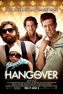
 > The Hangover is also a american comedy film, but targeting young adults. By looking at the image on the front you can tell straight away it is a comedy by the faces each actor is pulling and how the baby has sunglasses on. You can also tell that the man on the left hand side is the funny character of the film as he is holding the baby and he's wearing similar glasses to it.
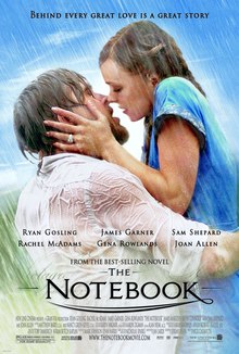
< The Notebook is a romantic film as you can tell instantly by looking at the image as the couple are kissing in the reain. It is about a young couple who fall in love during the 1940s. The target audience for this film would be for women.
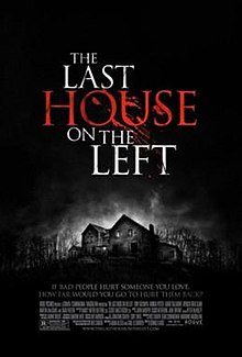
> Lastly, The Last House on the Left is a horror film and is a remake of the 1972 film. This film targets a young adult audience. The genre is shown from the black background and the isolated house in the centre which are horror conventions.
For our film classification we decided that 15 would be most appropriate. We thought certificate 15 as our trailer, although our trailer features blood and gore we felt that there isn't that much of it. Overall, we thought this would be appropriate as we could work with a lot without having to go over film regulations.
Throughout my advertising I have used an image of one of the girls included in the trailer as well as the title of the film, 'Abandoned'. I feel all three of my products (trailer, magazine and
poster) look professional as they share many relationships. For example-
-A similar image of the main protagonist (looking directly towards the camera in each image to make it more personal and make you feel involved)
-Same style of font for the film title (looks more professional)
-Dark Lighting (gives it more of a horror feel rather than a white background)
-Colour scheme (red, white and black. I feel all these colours look professional together and link with horror)
-Fonts are easy to read (also bold so they would stand out on the shelf in shops)
 |
| My Magazine Cover |
 |
| Total Film Magazine |
To help promote my film I created a new magazine that I thought sounded professional, I titled it 'Film Now'. I think this title works well and the way I have styled it on Adobe Photo Shop looks quite similar to other magazine names, for example 'Total Film'.
I mainly based my magazine on 'Total Film' as I really liked the layout of this. I decided to use a similar shot to the Total Film magazine as I liked how he was looking at the camera to draw the audience in and make them feel more involved. Keeping to the magazine conventions I added a 'FREE BATMAN POSTER' in the top right hand corner to hopefully attract more of the audience. I darkened a side of my face on Photo Shop as I thought it looked scarier. The house colours I chose were red, white and black like Total Films colours as I thought this worked well and my image had a tint of red in it.
 |
| My Poster |
 |
| Mirrors Poster |
To help promote my film I had to also make a horror poster. A lot of inspiration from my poster came from the film 'Mirrors'. For my poster I used a close up and slightly blurred the image by choosing 'Wind' on Photo Shop. I thought this created a really good effect like the victim had seen something and was about to run away, I feel the image in 'Mirrors' gives the same impression. I kept my poster quite simple as I think it looks more effective and may lead the audience into wanting to know more about the film.
It's a good idea to begin with some discussion fo the role of the distributor and to include some examples from other films, but then you have to go on and give a lot more detail about your own products, where you should start by comparing your poster and trailer, which are both examples of advertising, and show how they work together to reinforce the central marketing message. Look at image on the poster, colours, fonts, use of tagline, any shared references to a website etc etc. Only then should you go on to discuss your film magazine cover, as an example of the successful generation of publicity by the distribution company. And here you should explain how a distributor goes about trying to get such publicity (press packs, interview schedules etc - see the FDA website).
ReplyDelete